
Van's Air Force
You are using an out of date browser. It may not display this or other websites correctly.
You should upgrade or use an alternative browser.
You should upgrade or use an alternative browser.
Productivity at Work
- Thread starter JohnCFord
- Start date


longranger
Well Known Member
Michael White
Well Known Member
hey John,
What software are you using there?
AutoCAD from the looks of the screen.
JohnCFord
Well Known Member
hey John,
What software are you using there?
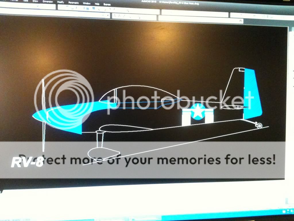
AutoCad 10. The front, top, and side views are available through Vans website.
http://www.vansaircraft.com/public/downloads.htm
Cheers!
Michael White
Well Known Member
John,
Nice looking scheme you've got going there. I don't want this to come out wrong, but I do have one nit to pick, if I may...the paint scheme you're working on is obviously a WWII inspired scheme (Maj. George Preddy's "Cripes-a-Mighty" perhaps?), but the insignia you show in the side view is the post-1947 National Insignia (with the red bar in the "stars and bars"). You will want to change that out to the more appropriate late WWII insignia without the red bar to keep the scheme more consistant with it's time period.
Here is a very good article that covers the different versions of the National Insignia and the time periods for which each was valid. It also will give you the correct proportions for the insignia (the star does not go all the way to the edge of the circle when the insignia has the bars, for instance). I have found this article to be invaluable with my scale R/C models, and I hope you enjoy it as well.
http://www.bowersflybaby.com/stories/army_paint.html
Again, I don't mean to step on your toes, here, and I hope you won't take it that way. I just have an absolute bug about this particular issue (obsessive-compulsive scale R/C modeler), and I'm just trying to provide some information to help you get the details right on what will be a sharp looking paint scheme.
Warmest regards,
JohnCFord
Well Known Member
John,
Nice looking scheme you've got going there. I don't want this to come out wrong, but I do have one nit to pick, if I may...the paint scheme you're working on is obviously a WWII inspired scheme (Maj. George Preddy's "Cripes-a-Mighty" perhaps?), but the insignia you show in the side view is the post-1947 National Insignia (with the red bar in the "stars and bars"). You will want to change that out to the more appropriate late WWII insignia without the red bar to keep the scheme more consistant with it's time period.
Here is a very good article that covers the different versions of the National Insignia and the time periods for which each was valid. It also will give you the correct proportions for the insignia (the star does not go all the way to the edge of the circle when the insignia has the bars, for instance). I have found this article to be invaluable with my scale R/C models, and I hope you enjoy it as well.
http://www.bowersflybaby.com/stories/army_paint.html
Again, I don't mean to step on your toes, here, and I hope you won't take it that way. I just have an absolute bug about this particular issue (obsessive-compulsive scale R/C modeler), and I'm just trying to provide some information to help you get the details right on what will be a sharp looking paint scheme.
Warmest regards,
Michael, your critique is very well received. While I was at work I was working from only memory and was going for the July 1943 - September 1943 based on a squadron/Signal publications book on the Corsair. I was pretty sure the red dot was wrong but thank you very much for the reference. I will use when ever I need it from now on. For all those of you that are watching (and you know who you are
") ), final paint will be historically accurate based on an actual aircraft flown in WWII. I have not chosen one yet but when I do I'll make sure it's right at the time a particular mission was flown. Matt Jolley of warbirdradio.com was right. "Just paint it and someone will let you know it's wrong".
), final paint will be historically accurate based on an actual aircraft flown in WWII. I have not chosen one yet but when I do I'll make sure it's right at the time a particular mission was flown. Matt Jolley of warbirdradio.com was right. "Just paint it and someone will let you know it's wrong".Thanks again Michael. I'm having a lot of fun here on VAF.
BuckWynd
Well Known Member
Invasion stripes
There is some information about the specs for invasion stripes on the following sites:
Wikipedia "Invasion Stripes" article
Air-Land-Sea Weapons article
VAF Discussion from 2006 which suggests that 12"-wide stripes might be the correct scale width for RVs.
Hope that helps!
There is some information about the specs for invasion stripes on the following sites:
Wikipedia "Invasion Stripes" article
Air-Land-Sea Weapons article
VAF Discussion from 2006 which suggests that 12"-wide stripes might be the correct scale width for RVs.
Hope that helps!