
A few months ago in a previous thread, I had promised I would post my performance curves I have been generating from my recent flight test. I was waiting to get points at 12,000-14,000 ft and get a better understanding of where the wide open throttle (WOT) boundary might be but unfortunately I have had a medical set back and will not be flying for 6-9 months. I thought I would post what I do have and update later this year when I get back to flying.
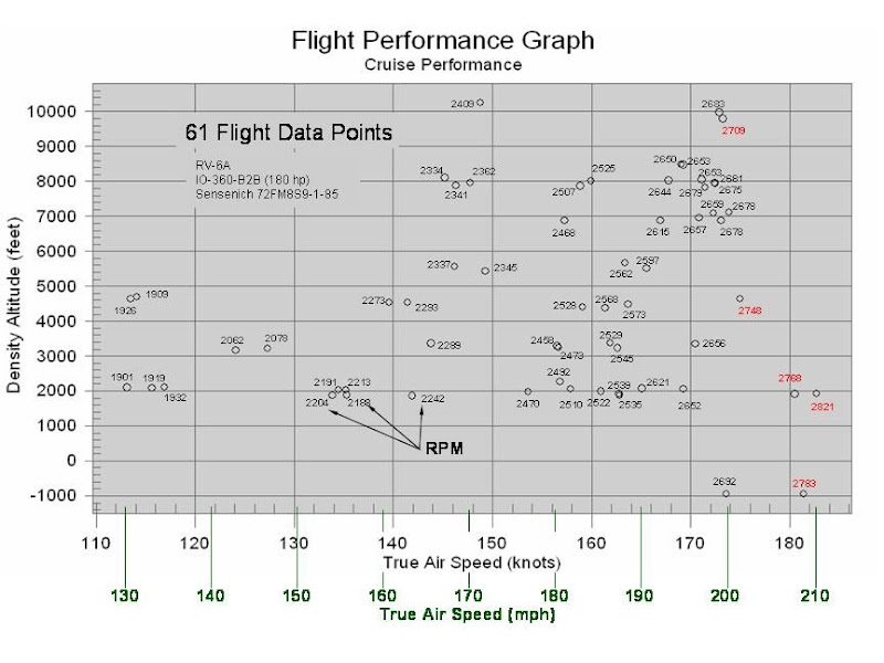
My RV has an Aerosport Power IO-360-B2B (180 hp) engine with a fixed pitch Sensenich 85” prop. Figure 1 below shows all 61 data points that I collected during 5 flights and 9 flight hours. The numbers next to the points are the corresponding RPM at that flight condition. Each point actually represents >30 data points taken over a minimum of 60 seconds of steady flight and have been averaged to get one point on the plot. I can do that as I have a flight data recorder (FDR) in my RV-6A that records all flight performance perimeters every 1-2 seconds. True Air Speed (TAS) was obtained using a calibration curve, which I generated from earlier flight testing, to get from indicated airspeed (IAS) to calibrated airspeed (CAS) and equations from Kevin Horton’s webpage to get TAS from CAS.
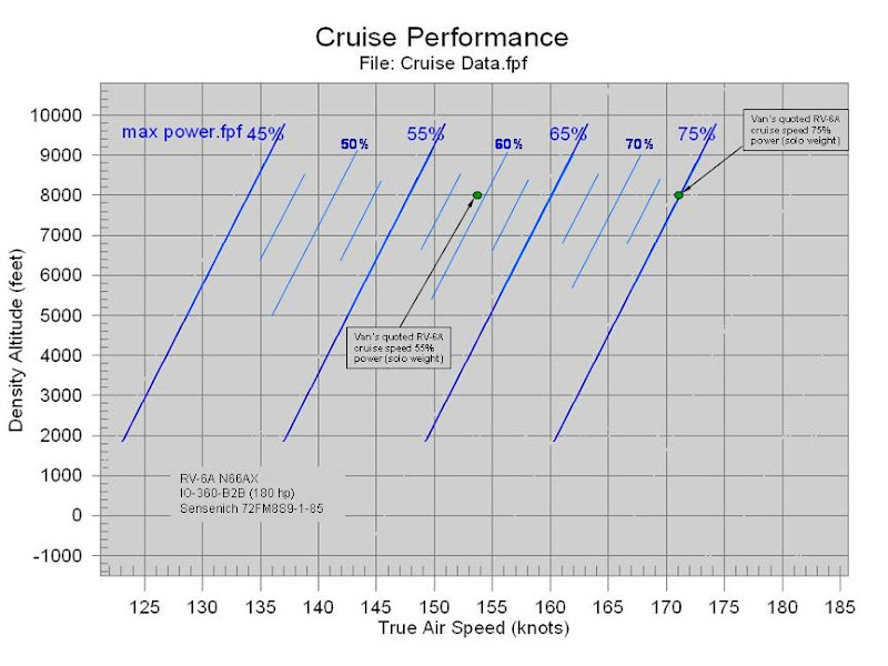
From these points I wanted to be able to plot percent power lines so I converted each point using RPM, MP, OAT, and pressure altitude. It actually was not too hard as my flight data recorder automatically calculates percent power for my engine. I then used regression analysis to draw lines of constant percent power through the data. The plot in Figure 2 is for the data points where I leaned to max power (150º F rich of peak EGT). Also plotted on the chart are the two cruise points that Van’s quotes for the RV-6A. My data exactly matches Van’s for the 75% power 8,000 ft point but is off by about 6 kts on the 55% power point. (This could be due to me collecting only a few points down to 45% power which may have skewed the regression analysis to pull left the percent power curves. I found during testing that the lower the power setting the harder it was to get a constant leaning process.)
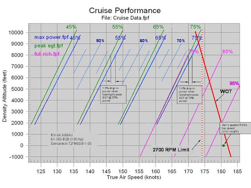
In my data RPM tracked linear with TAS for my fixed pitch prop (see graph in previous posting) so the RPM limit is just a vertical line. I plotted the 2700 RPM limit line in Figure 3. I also sketched in a wide open throttle (WOT) curve but I am not sure how accurate it is as I was unable to get a good curve to go through the 6 points I had for WOT. As indicated in the opening paragraph of this post, I would really like to get some more data points to determine if it is linear or has some break to it.
Need more WOT data and flight data above 10,000 ft to see complete flight envelop.
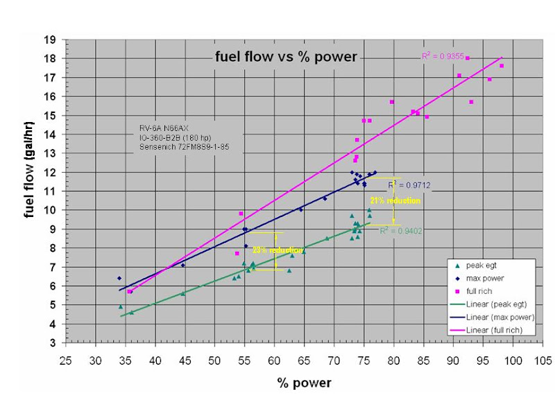
At 75% power and 8,000 ft I got a 21% reduction in fuel flow for only a 1.5% reduction in best power.
At 55% power and 8,000 ft I got a 23% reduction in fuel flow for only a 2.5% reduction in best power.
It would be nice to see where leaning to 50º F lean of peak EGT would fall on the plots.
My RV has an Aerosport Power IO-360-B2B (180 hp) engine with a fixed pitch Sensenich 85” prop. Figure 1 below shows all 61 data points that I collected during 5 flights and 9 flight hours. The numbers next to the points are the corresponding RPM at that flight condition. Each point actually represents >30 data points taken over a minimum of 60 seconds of steady flight and have been averaged to get one point on the plot. I can do that as I have a flight data recorder (FDR) in my RV-6A that records all flight performance perimeters every 1-2 seconds. True Air Speed (TAS) was obtained using a calibration curve, which I generated from earlier flight testing, to get from indicated airspeed (IAS) to calibrated airspeed (CAS) and equations from Kevin Horton’s webpage to get TAS from CAS.
Figure 1. TAS vs. Density Altitude at various RPM settings
One thing to point out is there are several data points close to one another on the plot. I ran most of the flight points at several mixture settings. I took data at full rich, at economy cruise (peak EGT), and at lean for max power (150º F rich of peak EGT). Figure 1 shows all the points, regardless of mixture setting.From these points I wanted to be able to plot percent power lines so I converted each point using RPM, MP, OAT, and pressure altitude. It actually was not too hard as my flight data recorder automatically calculates percent power for my engine. I then used regression analysis to draw lines of constant percent power through the data. The plot in Figure 2 is for the data points where I leaned to max power (150º F rich of peak EGT). Also plotted on the chart are the two cruise points that Van’s quotes for the RV-6A. My data exactly matches Van’s for the 75% power 8,000 ft point but is off by about 6 kts on the 55% power point. (This could be due to me collecting only a few points down to 45% power which may have skewed the regression analysis to pull left the percent power curves. I found during testing that the lower the power setting the harder it was to get a constant leaning process.)
Figure 2. Leaning for Max Power Cruise Performance
As mentioned before, I took data at several mixture settings so the next plot, Figure 3, shows how the power varied with mixture setting. The blue curves are the max power curves (same as the previous plot). The green curves are when I leaned to peak EGT for economy cruise. The magenta curves are when I ran full rich, which I only did for 75% power and above where leaning is not recommended per Lycoming guidance.In my data RPM tracked linear with TAS for my fixed pitch prop (see graph in previous posting) so the RPM limit is just a vertical line. I plotted the 2700 RPM limit line in Figure 3. I also sketched in a wide open throttle (WOT) curve but I am not sure how accurate it is as I was unable to get a good curve to go through the 6 points I had for WOT. As indicated in the opening paragraph of this post, I would really like to get some more data points to determine if it is linear or has some break to it.
Figure 3. Cruise performance for various mixtures settings
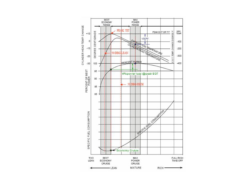
Looking at a max power cruise at 8,000 ft, my plot shows 75% power when leaning to peak EGT is about equal to 74% power when leaning to max power. This is approximately a 1.5% reduction in best power (74%/75%). The plot shows 55% power when leaning to peak EGT is about equal to 53.5% power when leaning to max power. This is approximately a 3% reduction in best power (53.5%/55%). A plot in the Lycoming engine operating handbook, shown in Figure 4, shows a 4% reduction in power for leaning from max power to max EGT. Since the peak EGT and max power curves slightly diverge, extrapolation shows that up at 12,000 to 14,000 ft the power loss will be 2-3% which in turn will calculate out to a 3-4% reduction in best power just like the Lycoming chart shows. The Lycoming curve is a generic plot so not sure if it is supposed to represent cruise at 8,000 ft or 14,000 ft. One other thing to note is that my data shows a fall off in performance if you run full rich just as the Lycoming curve shows. I lost about 1.5% of best power when running rich over running at max power (see magenta curves).
Figure 4. Representative effect of leaning on CHT, % Power, EGT, and Specific Fuel consumption
As shown in Figure 4, for each mixture setting there is a different specific fuel consumption (fuel flow). Figure 5 shows how my fuel flows varied with mixture settings. There is quite a bit of scatter in the data since measured fuel flow accuracy tends to be pretty rough. In my collected data, the fuel flow can jump around pretty good (±5%) even when sampling the data ever 1-2 seconds.
Figure 5. Fuel Flows for varying mixture settings
Overall conclusions:Need more WOT data and flight data above 10,000 ft to see complete flight envelop.
At 75% power and 8,000 ft I got a 21% reduction in fuel flow for only a 1.5% reduction in best power.
At 55% power and 8,000 ft I got a 23% reduction in fuel flow for only a 2.5% reduction in best power.
It would be nice to see where leaning to 50º F lean of peak EGT would fall on the plots.
Last edited: