![]() |
Panel decals - typeface, capitalization, hyphenation
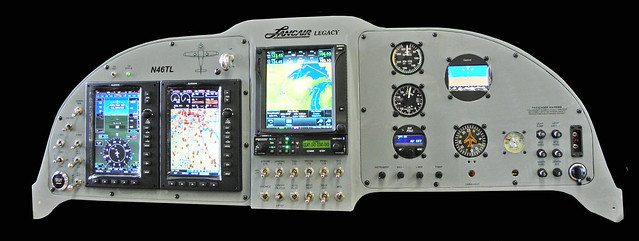
I'm designing my panel decals and looking for some input.
1) Do people generally use all caps, or mixed case for switches/breakers? Is one more readable than the other? 2) What typeface are people using? No, I won't consider comic sans or any serif type faces :) 3) Is autopilot generally hyphenated or not? |
I can't speak for all people, but I used:
1. Mixed case 2. Calibri - used Word to create dry transfers 3. I suspect many label breaker AP. Most of the traditional labels in my panel are electronic on the VP/X, which are displayed on the EFIS. |
COMIC SANS ALL CAPS FTW! :)
|
In general - All caps and a simple font such as Helvetica or Arial
Bold and abbreviations by personal taste. MASTER Arial bold MASTER Arial Black MASTER Arial I think looks better than Master Arial Black You decide which one is easier to read and comprehend at a quick glance...:) |
letters etc.
as others have said, make what looks good to you.
there are lots of examples out there, look at as many as you can, and you'll see the 'bad' examples too! ( black letters on a dark brown panel etc.) Millions have been spent on 'the most legible' lettering studies. Look at a highway sign....most states & provinces are converting the old 'highway gothic' to this font......(to the layperson, yeah, it's a lot like arial or helvetica medium.) the latest flavour is called 'ClearView' , and exhaustive testing showed faster recognition and longer viewing distances, always with upper and lower case. that said....esthetically I agree that a nice line of all caps has a certain formaiity to it... I mean, you know it says 'MASTER' not 'Mister'. If you use some simple design software, it's easy to condense the longer words to reduce the need to abbreviate or hyphenate. ( if you're not savvy, your 9-year old neighbour can help!) keep in mind, after a few months, you'll want to change something! :) |
Quote:
|
Quote:
|
Quote:
|
A few things to consider ...
San Serif fonts are easier to read (and thus easier to read quickly). Caps or mixed is a personal option but for single words and word-pairs, all caps is easier to read (quickly) Abbreviations are acceptable as long as they are common or meaningful. In this case it really is personal choice. For example, MKR-BCN may be obvious to you but the next builder may want MRKR.BCON as their representation. If you use abbreviations it helps to be consistent. If you shorten "LIGHTS" to "LTS", then consider doing it everywhere. |
Typeface
Quote:
|
All times are GMT -6. The time now is 03:45 PM. |